Understanding Heat Maps
I'm sure you'e seen one of these:
And you probably thought, "What on earth???", and skipped over it.
This is called a "heat map". It is a very clever way to communicate information that is difficult to summarize any other way, and once you understand what it does, I think you'll love looking these.
These charts turn numbers into color. Then instead of squinting at a bunch of numbers in a table ("...is this one bigger than the other one?"), you can make the values different colors and detect the patterns in the data without having to compare numbers; you just look at the patterns of color.
Actually, you look at heat maps all the time. For instance -
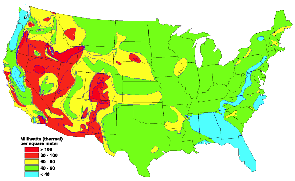
This is a map of geothermal heat output (or something like that) across the USA. The legend tells us what the colors mean. The highest values for thermal output are red, the lowest are blue, and green and yellow are levels in between.
Once you know the secret code, you can figure out what's going on in this map with just a glance. Don't look for geothermal energy in Florida. But southern Arizona and New Mexico, and especially Nevada, are "hot spots" (sorry) for geothermal energy. You see these for weather patterns, for housing costs across the country, and for anything else you can measure with a number that varies with geography.
This chart quickly communicates when the yearly temperatures in Boston in 2012 - July and August are hot, and November through March are cold.
Here's a heat map of the sort you will be looking at to make sense of the genetics of dogs.
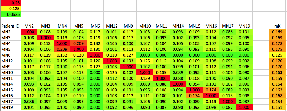
This is a table containing kinship data (a measure of genetic similarity) for 14 Mongolian Bankhar that are taking part in the breeding project to supply dogs to the nomadic herders so they can coexist with the predators that would otherwise prey on their livestock. They gathered these dogs up from various places around the (vast) country, so the expectation is that most would be unrelated. The identification numbers of each dog (e.g., MN2, MN3, MN4, etc) are listed down the axis on the left, and also across the top in the same order. In the upper left is the legend that tells you how the values in the table are color-coded.
One of the ways to assess the genetic similarity of a pair of dogs is using the "kinship coefficient". The kinship coefficient (K) is the fraction of the genes in two dogs that were inherited from a common ancestor, what we call "identical by descent" (IBD). You will recall that the coefficient of inbreeding (COI) is the fraction of genes in a dog that homozygous as a result of inheriting two copies of the same allele from an ancestor common to both parents. So you can see that the COI and K are related - in fact, the coefficient of inbreeding of a dog is the kinship coefficient of its parents. Conversely, the K of a male and female pair of dogs is equal to the predicted COI of a litter if they were bred together.
Since we know the level of inbreeding to expect from particular matings, we can use this information to assess relatedness of a pair of dogs. The inbreeding coefficient of a dog produced by mating of two full siblings from unrelated parents is 25% (0.25). So we can also say that two dogs for which K = 25% are as genetically similar as full siblings, even if they are not obviously closely related based on pedigree information. Because most modern purebred dog breeds descend from just a handful of founder dogs and also survived serious bottlenecks (such as during the two World Wars, when many breeds nearly went extinct), in many cases the members of a breed have a high degree of genetic similarity that is reflected in high inbreeding coefficients (as summarized here).
To decode the information in the table above, we need to know what levels of relatedness the colors represent, which is indicated in the upper left corner of the chart. Two dogs as genetically similar as siblings will have a K of 0.25 (25%). For similarity at the level of half-siblings, K = 0.125 (12.5%); and two dogs as similar as first cousins will have K = 0.0625 (6.25%).
This chart is called a "kinship matrix", and this one compares all possible pairs of dogs. If you were interested in assessing potential mating pairs, you might just include a few females on one axis and the males under consideration on the other.
The diagonal red line running from corner to corner is the K of each dog compared with itself, which of course should equal one. If you have different dogs on each axis (as when assessing males against females), there will not be a red diagonal line.
How do you read a kinship matrix?
For example, if you bred the two dogs identified as MN3 and MN2, the average COI predicted for the litter is 0.108, or 10.8%. Looking at the color chart, you will notice that the values I chose correspond to the inbreeding expected from a cross of first cousins (6.25%), half siblings (12.5%), and full siblings (25l%). The cell for our cross of MN3 x MN2 is greenish yellow, which tells us that the puppies in this litter would on average be a bit more inbred than first cousins but not as much as half siblings. Remember that each puppy inherits a different mix of alleles, so some will be more inbred than the predicted average, and some will be less inbred. But this ball-park figure tells you that is a breeding with about a 10% risk of producing a genetic disorder in a puppy.
As you scan the colors on the table, you will notice immediately that MN4 and MN5 are related, with a kinship coefficient of about 20%, which is just a bit less than full siblings. MN15 and MN16 are also related by a bit more than half siblings. Also, there are dogs (e.g., MN6) that are not related at all to some of the dogs in the table.
So, with just a glance at a table like this, you can get a good idea of the "structure" of the population.
Notice the last column to the right of the main table. This is the mean kinship (mK) of each dog. For example, the average kinship of MN2, calculated by taking the mean of all of the values in the first row (including the dog with itself, which is 1.0), is 0.169, or 16.9%. Notice a few rows down that MN6 has a mean kinship of 0.125 (12.5%), which is the lowest value for any dog. This tells you that the dog that MN6 has the least genetic similarity with the other dogs in the population, and because of its relative uniqueness it is genetically most valuable in terms of protecting genetic diversity. This dog is related to some of the dogs in the population (yellowish squares) about about the half-sib level, rand not related at all to some (when kinship = 0.0).
The Mongolian Bankhar is a land race and we would expect a high level of genetic diversity and low relatedness among the dogs. Most purebred dog populations have high levels of inbreeding, which means the heat maps for them will look very different.
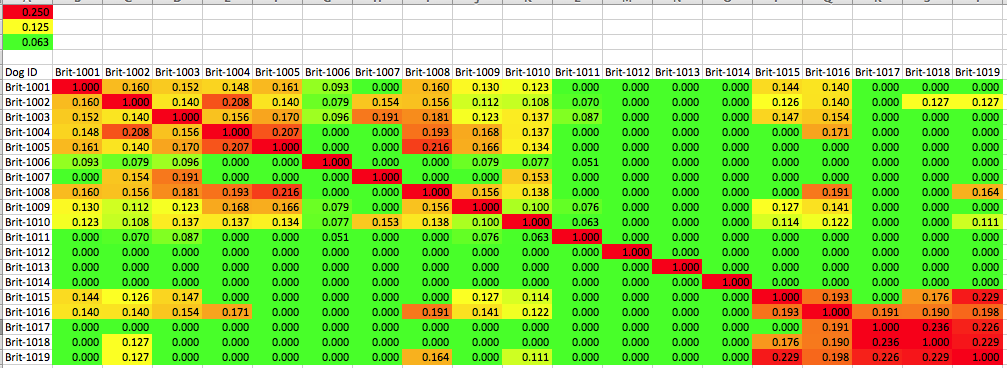
The Brittany is of the few modern gun dog breeds for which there is still some genetic overlap between the field and bench dogs, with some dogs active in both conformation and hunting.
We can get some information about the level of inbreeding and relatedness among individuals using the data produced by genotyping using SNPs.
This is a kinship matrix for a population of anonymous Brittany dogs. You can see two groups of related animals, in the upper left and lower right corner, as well as many individuals who are essentially unrelated to the other dogs in the population.
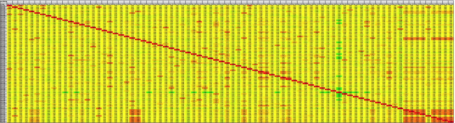
You will run into other examples of heat maps, and perhaps also some like this specifically for dogs. You should find that they can tell you much about a population just at a glance and are a very useful tool in understanding the structure of the population.