Tibetan Spaniel Preservation Project
|
We're raising $15,000 to fund this project.
We appreciate your support! 
|
Join the Facebook group for the project!

This is a preliminary analysis from an incomplete pedigree database. More coming soon...
PRE-WAR
A single pre-war dog, Skyid, appears in the pedigree of the dogs from which the breed was rebuilt after the war.
This pedigree has Skyid as the lone dog from pre-war (at the bottom) and his ancestors (above), which go back to 6 founder dogs (in red; 4 males and 2 females). In addition to Skyid, 6 new post-war dogs were added, and we will talk about those separately.
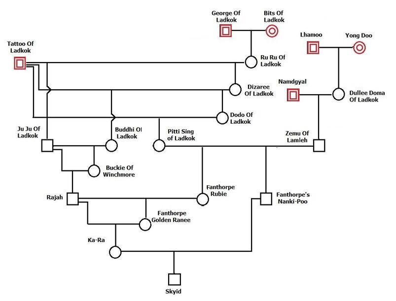
There are some important points here.
From the pedigrees, we have a total of 12 dogs in red - these are the dogs that should be the source of ALL of the gene in the breed (up until additional dogs were added later). This would mean that the size of the initial gene pool (f) is 12.
From this information, however, we can also see the loss of some of the initial genetic diversity.
George and Bits of Ladkok only produced one offspring, Ru Ru, so only half of their genes were carried on. Likewise Lhamoo and Young Doo only produced one offspring, so only half of their genes were passed on. Namdgyal produced one offspring, so again, half of his genes were passed on. Only Tattoo of Ladkok produced multiple offspring.
So 5 of the founder dogs behind Skyid contribute the genetic equivalent of 3.5 dogs. In population genetics, we want to keep track of the genetic diversity in the breed, so we would say this about the dogs behind Skyid:
f (# founders) = 6
fe (effective founders = 3.5
This means that 58% of the genetic diversity of the initial founders was passed on to the next generation of dogs.
POST WAR
For the post-war dogs, we have Skyid from above (connected to the 6 founder dogs from above in the red box), plus 5 other new, unrelated dogs (2 males, 3 females).
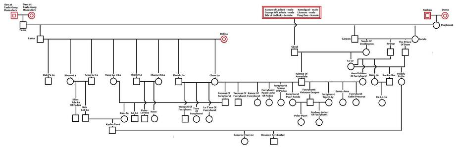
Skyid produced two offspring (Ramba of Armadale and Ta-Le. He was inbred, with a COI of 18%, which means that both of his offspring inherited a copy of the same allele for 18% of his genes. He had two offspring, and the first inherited half of his genes at random, and the other offspring also inherited a random selection, and we will estimate that roughly half of those are the same as the other sibling, so 75% of Skyid's genes were passed on to offspring, so that would be 75% of 3.5, or 2.6 genome equivalents. If 18% of the alleles inherited were the same in each offspring, then Skyid would pass on 2.5 genome equivalents. This is a wild estimate at this point. Population genetic software will simulate these steps and provide a better estimate based on probability of Skyid's contribution; we'll worry about that later.
For the other dogs:
The pair from the Tashi-Gong Monastery produced a single offspring.
Nashpu and Duma produced a single offspring.
Dolma produced multiple offspring. For now, let's assume that all of her genes were passed to offspring.
Tallying up the genomes from the other post-war founders, we have 0.5 + 0.5 + 1, plus whatever Skid contributes (count as 2.5).
If we tally this up (and I have it right, no promises there...), this would put the size of the initial gene pool of the breed at maybe 5 dogs. In a closed gene pool, genes are lost every generation, so the gene pool will only get smaller. (We will simulate this too later.)
So, for the period before the introduction of new imports several decades later, the maximum size of the gene pool is about 5 dogs
ADDITIONAL FOUNDERS
We are putting together the pedigree info for the new founders that were added later to the gene pool. Stay tuned...
We are putting together the pedigree info for the new founders that were added later to the gene pool. Stay tuned...
REGISTRATION DATA
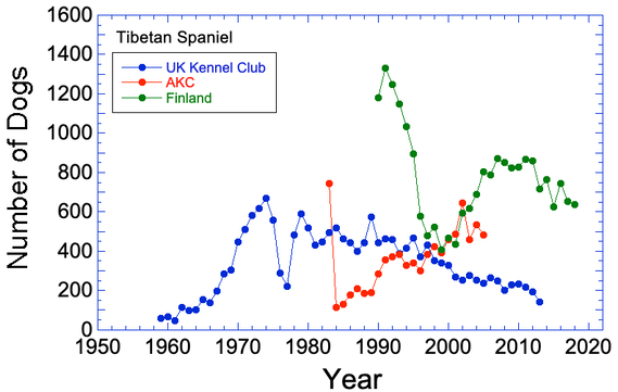
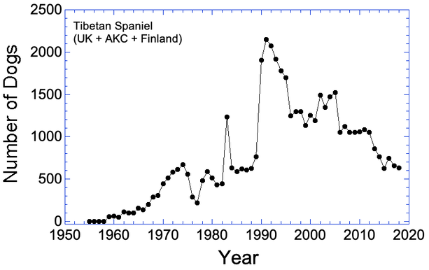
I have some breed registrations stats for the UK KC, AKC, and Finland, but none are complete. The patterns in total registrations are very misleading because of this.
We need people to find the data for other registries and to fill in the missing information for the ones we have.
I have posted the graph with the data I already have in hand. The first year of AKC recognition, I suspect they registered all known animals at once, which is why it is high. There is a worrying trend of falling registrations in the UK, and registrations of many AKC breeds have also been falling so we want to get those recent numbers on the graph. The breed was apparently very popular in Finland in the 1990s, but registrations over the last decade are falling. If the US population is also declining, that would indicate the possibility of an overall loss of numbers in recent years.
HEALTH SURVEY (UK KC 2004)
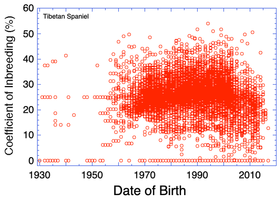
INBREEDING
Coefficient of inbreeding (COI) computed from preliminary pedigree data. Values of zero indicate that there are data missing for parents. These values will be underestimates of the true COI.
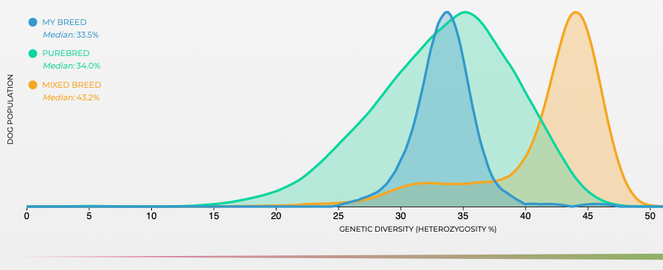
GENETIC DIVERSITY
These are data for genetic diversity, as "heterozygosity" (the fraction of genes that have two different alleles, vs homozygosity, two of the same alleles).
Heterozygosity goes from 0 to 0.5. The green curve is the average for all purebred dogs, orange is mixed breeds, and blue is tibetan spaniels.
These are data for genetic diversity, as "heterozygosity" (the fraction of genes that have two different alleles, vs homozygosity, two of the same alleles).
Heterozygosity goes from 0 to 0.5. The green curve is the average for all purebred dogs, orange is mixed breeds, and blue is tibetan spaniels.
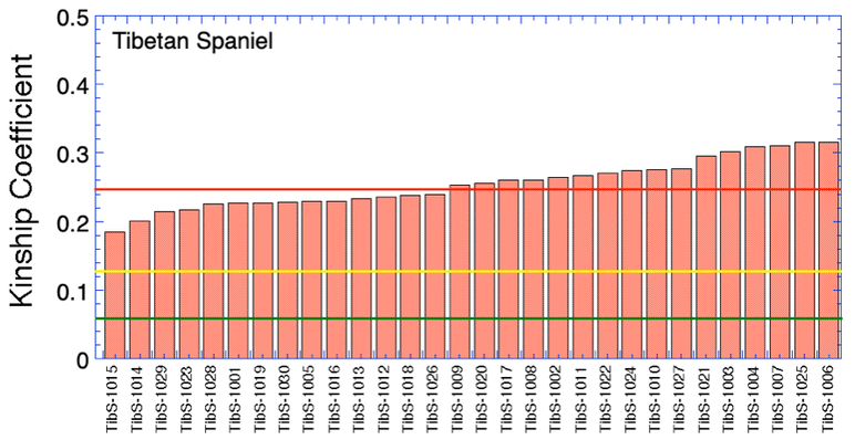
Which dogs are most valuable genetically? (part 1)
I have DNA data for 30 anonymous Tibetan Spaniels that were part of a research study. I don't know who they are, but we could do this same thing with your own dogs.
How can you know which dogs in your breed are most important to breed from? None of the 300 offspring of the popular sire is particularly valuable, because so many other dogs in the breed have the same sire so the same genes. The genetically valuable dogs are the ones that carry genes that are uncommon in the breed. These dogs are little reservoirs of genetic diversity, and you want to make sure they produce offspring so you can keep those valuable genes in the population.
We can do this by comparing the DNA for each dog with the DNA for every other dog in the breed, and calculate a statistic that tells us about genetic similarity - this is the kinship coefficient. (Like your relatives are your "kin".) Dogs that are more closely related and more genetically similar have a high kinship coefficient; dogs that are not closely related have a low kinship coefficient.
So if we calculate the kinship coefficients of all the dogs in the breed by comparing each one to every other dog, we can find the dogs that are most valuable genetically because they will have the lowest kinship coefficient.
I have done this with this population of 30 anonymous dogs, then plotted them by rank so it is easy to see which ones are most valuable - they are the lowest values on the left. The least valuable dogs are at the other end, on the right. I have also added three lines: the yellow line is the kinship coefficient of a dog that is the equivalent to a half-sib, on average, to the rest of the population. The red line is the level for full sibs, and the green line is first cousins. So this graph tells you that the most valuable dogs are the ones with the lowest average kinship coefficient, etc, but they are nonetheless very closely related on average to the rest of the dogs in the breed - at a level higher than half siblings.
This is DNA data, so this is telling you that these dogs are all highly related, but breeders should prioritize breedings to the dogs at the left end of the chart.
This is a simple example of an analysis we can do that uses something called a kinship coefficient. It provides extremely useful information, if you understand what it means.
Which dogs are most valuable genetically? (part 2)
Okay, so you identify the most valuable dogs using the graph of kinship coefficients above. But those values are just averages. Any dog can be more related or less related than the average. Wouldn't it be great to know which dogs would be the very best to breed to?
Here's how.
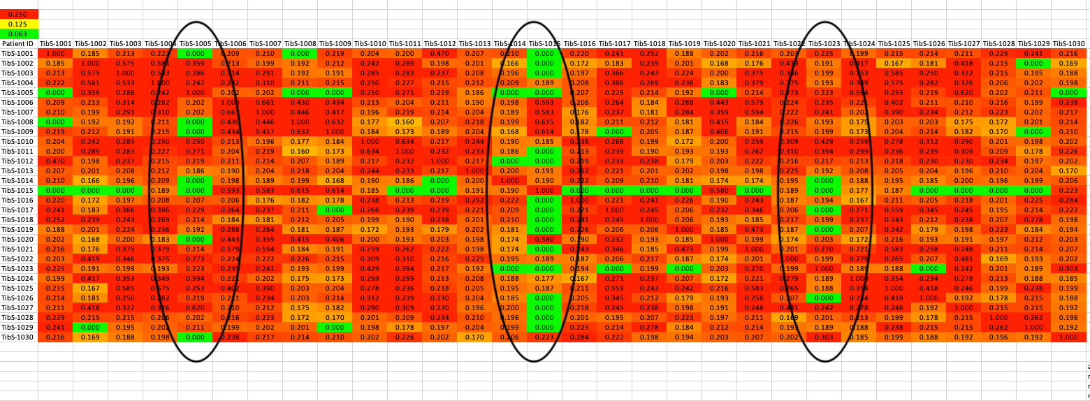
This table is a matrix. The dogs listed down the left side are also listed across the top row in the same order. So this lets you see the actual kinship coefficient between any PAIR of dogs, not just the average over all of them.
The colors mean the same as in the chart above. Red is as related as a full sib more more; yellow is half sib relatedness; green is first cousin or less.
Right away you can see one dog with a column of green squares right down the middle. That dog is the first one on the chart above. It turns out, that he is highly related to some dogs, but not closely related to others. Overall, his average is low, but you need to be careful which dog he is paired with.
Check out a few more pairs. There are dogs that aren't among the ones with a very low average kinship, but there are still dogs with low relatedness that they could be bred to and produce a litter with low inbreeding. With the chart above and this kinship matrix, it is very easy to see what the options are.
Wouldn't it be great to have this information the next time you breed a litter?!!
Okay, so you identify the most valuable dogs using the graph of kinship coefficients above. But those values are just averages. Any dog can be more related or less related than the average. Wouldn't it be great to know which dogs would be the very best to breed to?
Here's how.
This table is a matrix. The dogs listed down the left side are also listed across the top row in the same order. So this lets you see the actual kinship coefficient between any PAIR of dogs, not just the average over all of them.
The colors mean the same as in the chart above. Red is as related as a full sib more more; yellow is half sib relatedness; green is first cousin or less.
Right away you can see one dog with a column of green squares right down the middle. That dog is the first one on the chart above. It turns out, that he is highly related to some dogs, but not closely related to others. Overall, his average is low, but you need to be careful which dog he is paired with.
Check out a few more pairs. There are dogs that aren't among the ones with a very low average kinship, but there are still dogs with low relatedness that they could be bred to and produce a litter with low inbreeding. With the chart above and this kinship matrix, it is very easy to see what the options are.
Wouldn't it be great to have this information the next time you breed a litter?!!
Genetic "structure" of the breed
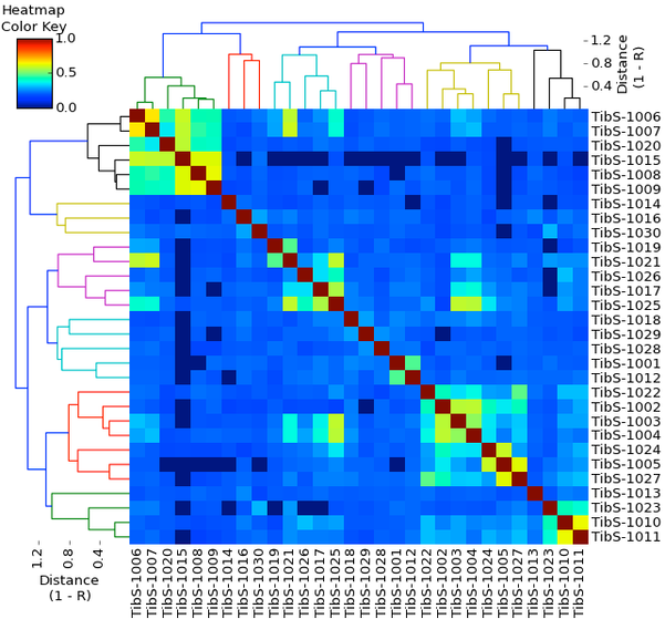
This isn't as complicated as it looks. These are the same 30 dogs as in the charts above. Once again, this is a matrix; the dogs down the side are listed in the same order across the bottom. Using the information about kinship determined from DNA analysis, the dogs have been clustered together on the basis of genetic similarity. This diagram is called a dendrogram ("tree" + "picture"). If you aren't familiar with dendrograms, there is a little tutorial here - https://www.instituteofcaninebiology.org/how-to-read-a-dendrogram.html.
This has produced three main clusters that are connected by dark blue lines across the top - one cluster on the left green and orange), and two connected clusters on the right (cyan, pink, yellow, and black). Within each major cluster there are subclusters that represent families or lines of related dogs. The shorter the vertical lines in a cluster, the more closely the dogs are related. For instance, in the green cluster on the far left, there is a pair of dogs that are very closely related (possibly full siblings), and several dogs related at various levels in the other green subcluster.
The large colored square is called a heat map. This is also more complicated than it looks, and in fact I'm sure you have seen these before in other contexts. Take a quick look at the tutorial about heat maps here - https://www.instituteofcaninebiology.org/heat_map.html
For each dog across the bottom and down the side, there is a square where they intersect. The color of that square indicates how similar they are genetically. Each dog is compared with itself, and those squares are dark red on the diagonal. If you look at the heatmap color key in the upper left corner, you can see that dark red corresponds with a genetic similarity of 1.0 - a dog compared with itself is 100% the same. You can easily spot the clusters of related dogs by the colors - warmer colors are more related (red, orange, yellow) and colder colors are less related (cyan, blue, dark blue).
Like the color matrix, this chart provides a lot of information very quickly. The colors indicate where clusters are, and the shades of blue indicate the variation in relatedness among the dogs in the population. Unfortunately, these are anonymous dogs, because it would be very interesting to see if these clusters have different representations of the post-war founder dogs and the dogs brought in later.
Cool, eh?
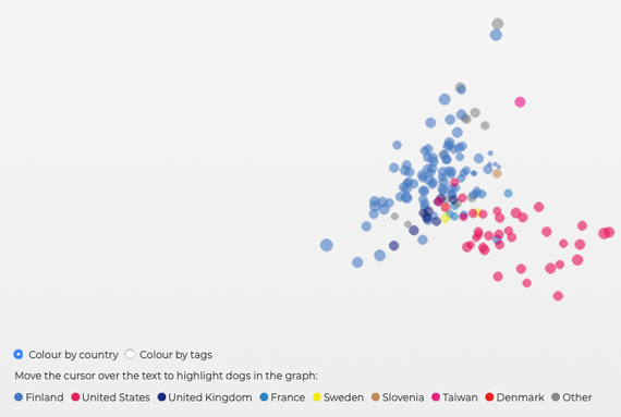
Principal Components Analysis (PCA)
PCA groups individuals according to differences between populations. For instance, it might separate the dogs in a population by sex (male and female), then by country of origin. If you are using raw DNA data, the only information the program uses is the variation in the DNA data. This graph shows that the 30 TS in this sample separate into two clusters based on their DNA, and if we color code the data points by country of origin, we can see that there are two distinct populations - one from the US, and another from Finland, with other countries scattered but mostly towards the European end. MyDogDNA is in Finland, so it is well represented in this plot. There really aren't enough data for the other European countries to be able to tell if they would form distinct populations as well.
PCA groups individuals according to differences between populations. For instance, it might separate the dogs in a population by sex (male and female), then by country of origin. If you are using raw DNA data, the only information the program uses is the variation in the DNA data. This graph shows that the 30 TS in this sample separate into two clusters based on their DNA, and if we color code the data points by country of origin, we can see that there are two distinct populations - one from the US, and another from Finland, with other countries scattered but mostly towards the European end. MyDogDNA is in Finland, so it is well represented in this plot. There really aren't enough data for the other European countries to be able to tell if they would form distinct populations as well.