Carrying on from my blog post "What are we going to do about Terriers" (which you will need to read in order to understand the rest of this), I decided to post the pages for all of the groups that I had compiled.
From these, I have now gathered together a page of "best" and "worst" breeds that will make it easier to get a sense for which breeds are in the most trouble. Note that I did not include all breeds for which there are data on the MyDogDNA (MDD) website, and for some breeds there aren't enough data to display. So if you don't see your breed on the "worst" list, don't take that to mean that it's in robust genetic health. Go see if there are data available that I didn't include.
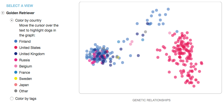
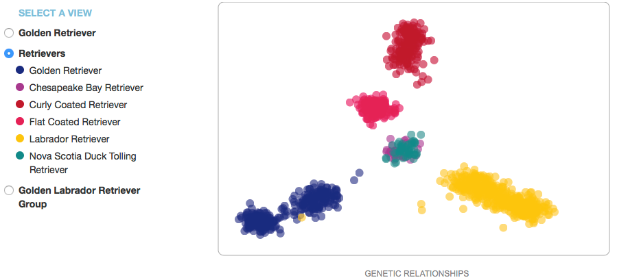
For each breed there is a scatter plot and a line graph. The scatter plot displays the data points for the individual dogs. They are usually color coded by country, and on the MDD website there are sometimes options to display these data by use (e.g., show, work, companion, etc).
Note that the scatter plot is not a typical graph: the x-axis is labeled "genetic relationships", and the y-axis has no label at all. This is because the graph was created by taking all of the data for a breed and asking the computer to find some characteristics in the DNA data that would separate all of the individuals along a gradient in the horizontal direction, then do the same thing in the vertical direction. This will separate all of the data in a way that displays the degree of genetic similarity (or difference) between individual dogs as proportional to the distance between their points. Then if you code the points by country of origin, you might see that the clusters correspond to different countries (like these data for Golden Retrievers). This is useful because it can tell you whether there are clusters of genetically distinct subpopulations in a breed, which would be handy if you wanted to outcross to improve genetic diversity in a litter. Because we don't really know what the actual differences are that separate these groups, the axes of the graph are usually labeled as "principal components"; in this case, "genetic relationships" is similarly vague.
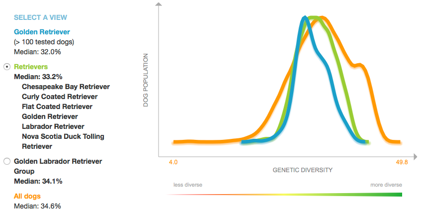
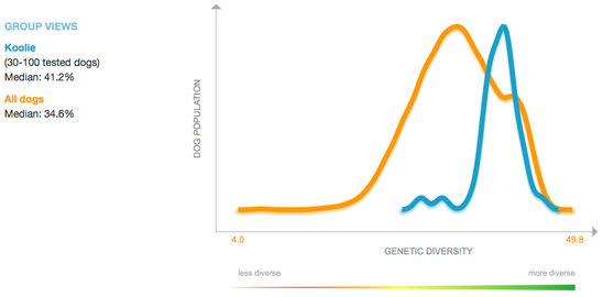
The line graph below displays the data for percent heterozygosity, which is the proportion of loci that are heterozygous (the two alleles at the locus are different). Higher numbers are better (in the "green-is-good" zone), and lower numbers correspond to low heterozygosity (= higher homozygosity = higher inbreeding).
The median value for Goldens is low (32.0%), but there is a tail in the "good" direction (representing dogs that are less inbred) and, as you can see from the scatter plot above, there are genetically distinct subpopulations that could be exploited to improve heterozygosity.
And if you're not happy about the data for your breed, join one of the ICB courses that teach you the basics of population genetics and how to breed to produce healthier dogs by protecting the health of your gene pool. (The next course starts 4 April.)
ICB's online courses
*******************
Coming up NEXT -
Basic Population Genetics for Dog Breeders
Class starts 4 April 2016
***************************************
Visit our Facebook Groups
ICB Institute of Canine Biology
...the latest canine news and research
ICB Breeding for the Future
...the science of dog breeding
